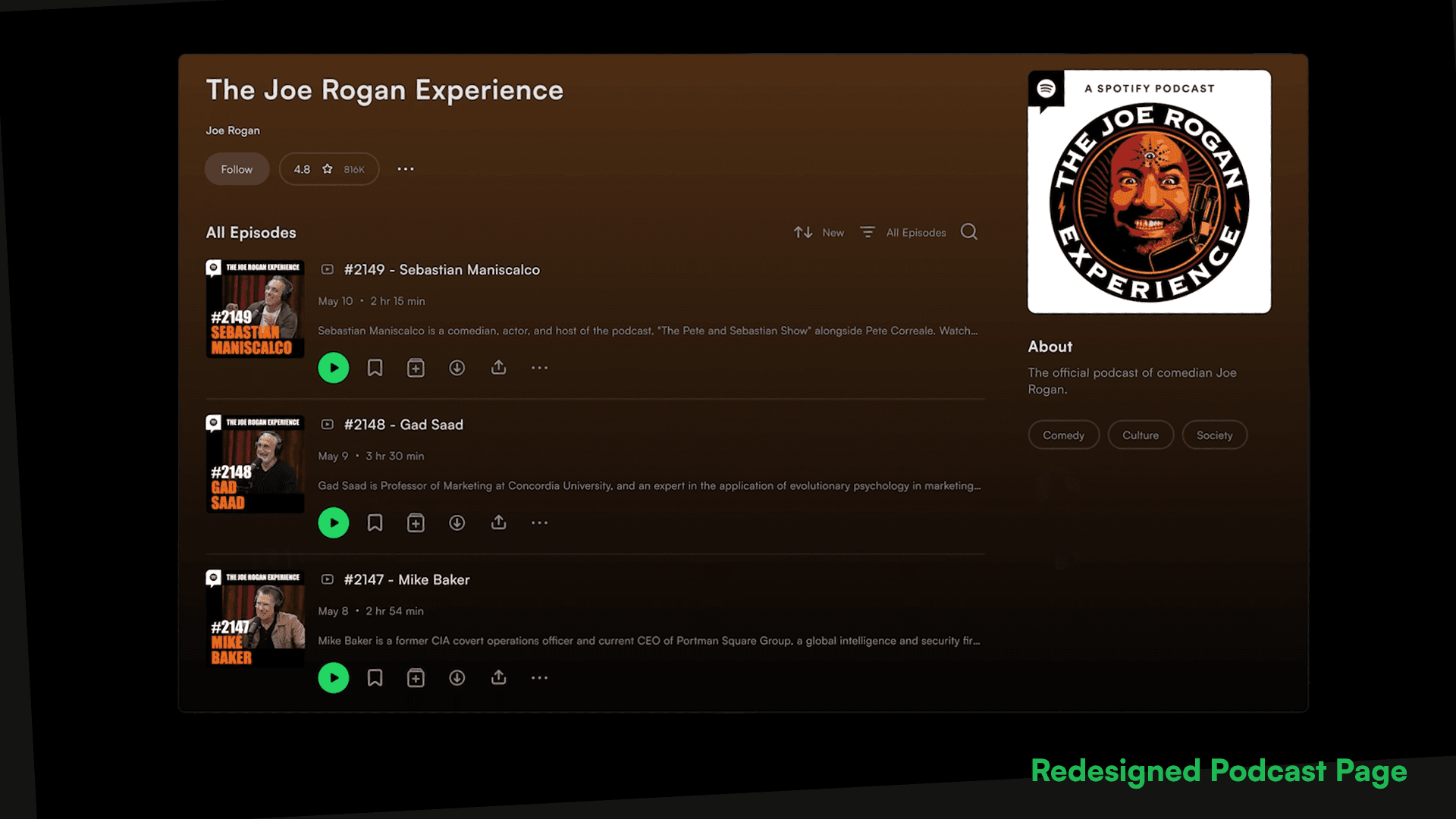
Easy music discovery
a streamlined redesign of Spotify built for clarity and lower cognitive load.
00
problem
spotify’s interface has become increasingly inconsistent and cluttered, burying its core functionalities under a bloated architecture. Users face high friction when navigating across devices, distinguishing between content types (music, podcasts, audiobooks), and managing their libraries. Furthermore, basic accessibility features like light mode are missing , and the app's social integration relies on a restrictive Facebook dependency that limits user connection.
solution
A streamlined, user-centered interface that strips away the extras and returns focus to five core essentials: Home, Search, Library, Profile, and Now Playing. The redesign unifies the visual language with dynamic themes and clear visual indicators for media types. It also introduces a native friend-adding system utilizing unique IDs , simplifies desktop navigation with dedicated tabs , and introduces a highly requested light mode for improved accessibility.
The Spotify Redesign was born out of a passion for seamless digital interfaces and personal experiences as a daily listener. The project recognized the challenges faced by individuals who strive to navigate massive audio libraries while juggling demanding, fast-paced schedules. With a clear vision of creating a reliable and accessible product experience, the design process brought together rigorous human-centered research and a completely restructured information architecture.
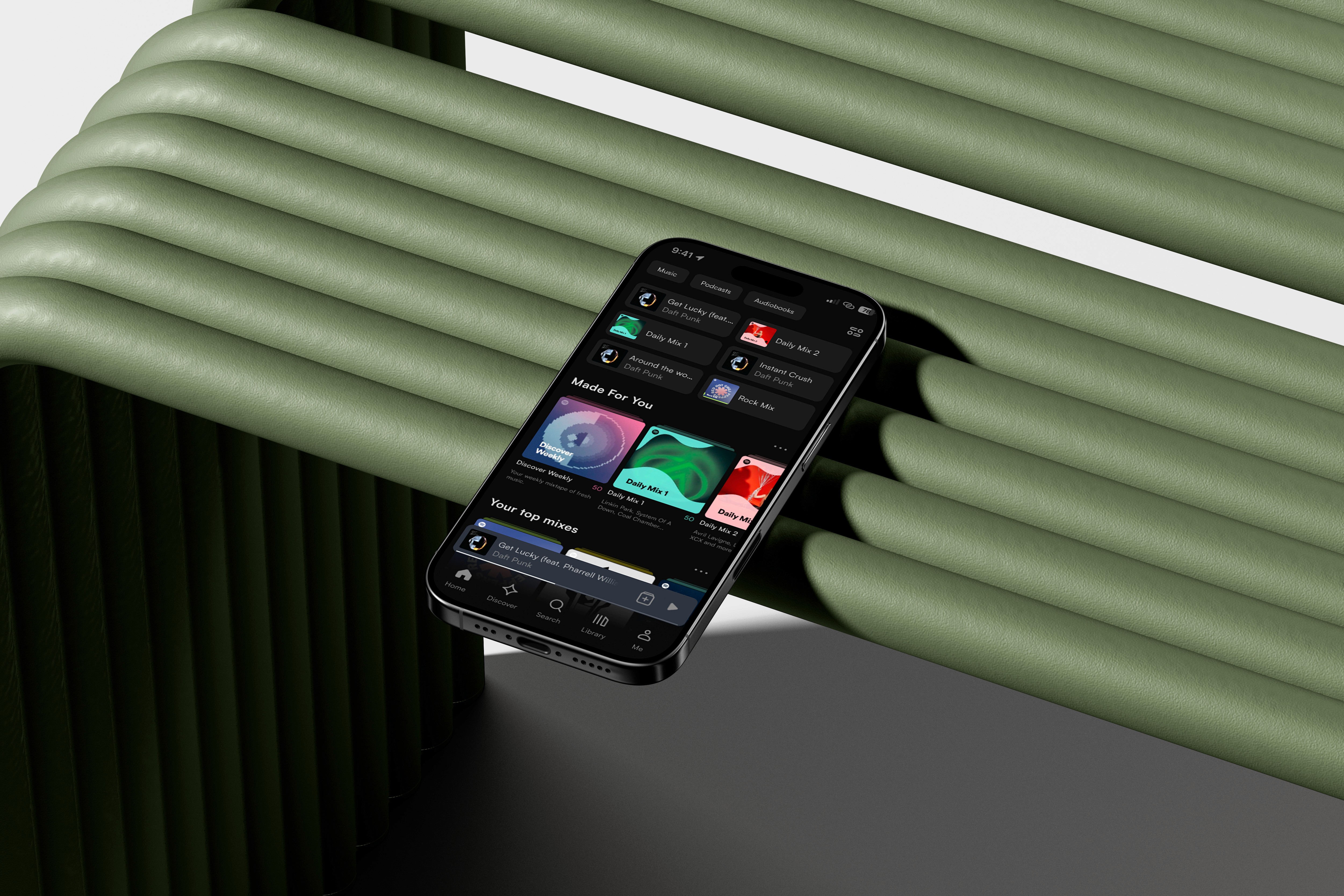
Driven by this mission, the project developed a new structural direction featuring three separate, standalone apps, which revolutionizes the way listeners connect with their audio. The ecosystem provides a platform where users can easily browse and manage their media without the friction and cognitive load of a single, bloated interface. The redesign's rigorous adherence to functional Spotify DNA, strictly avoiding experimental high-fashion editorial styles, ensures that every interaction is intuitive, familiar, and deeply focused on user control.
Since its conceptualization, this redesign aims to transform the daily routines of dedicated listeners. The architecture prioritizes the convenience and reliability of the platform, allowing users to appreciate the ease with which they can manage their music, podcasts, and audiobooks across devices. Listeners can connect directly using native user IDs and navigate comfortably with accessibility upgrades like Light Mode, fostering a sense of shared musical connectedness without relying on third-party social integrations. This approach has not only simplified the audio experience for busy individuals but has also established a unified environment for listeners who share a common goal of pure, uninterrupted enjoyment.
year
2024
timeframe
4 weeks
tools
Figma, After Effects, Illustrator
category
Product Redesign
01

02

03

04
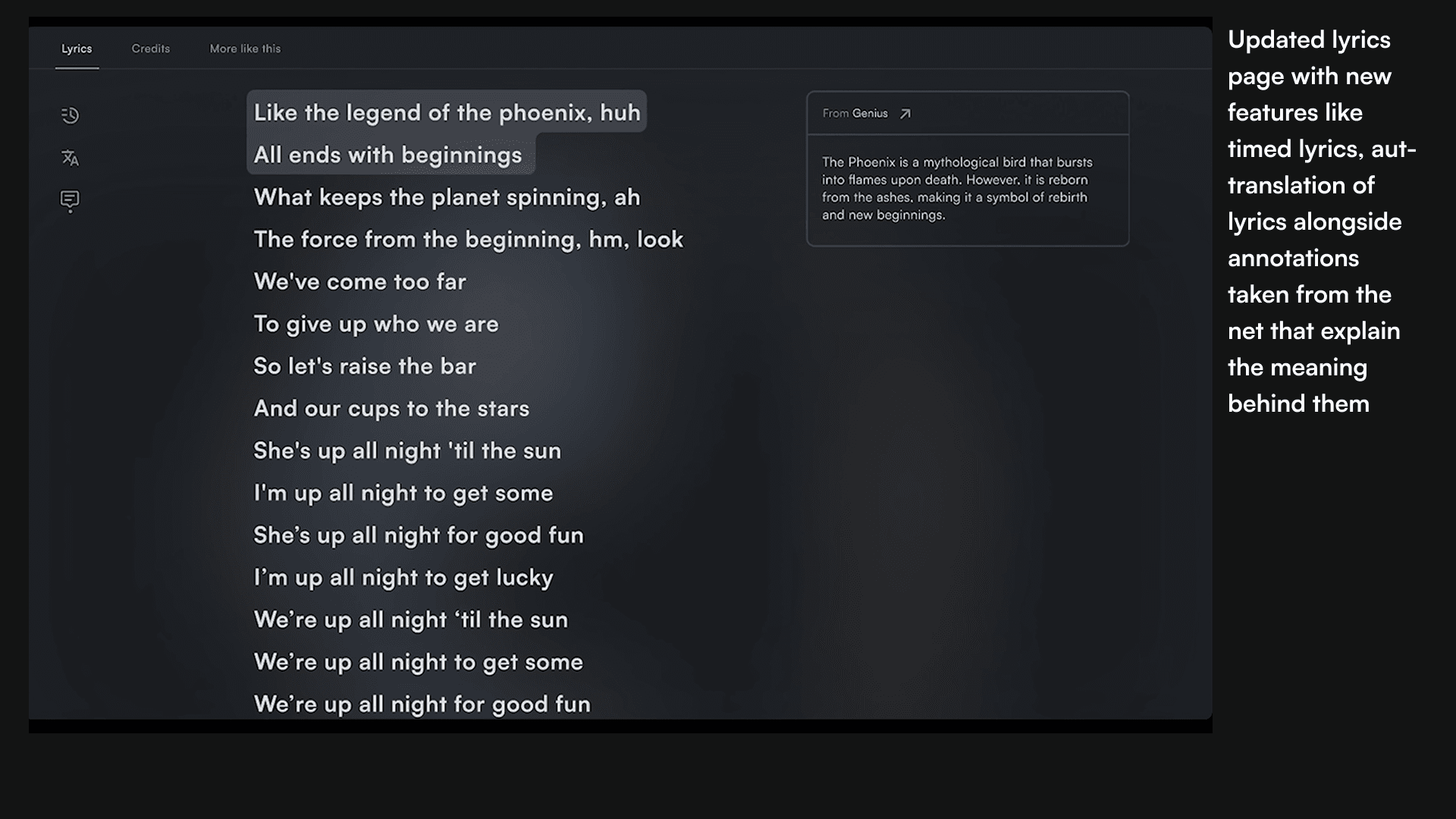
05
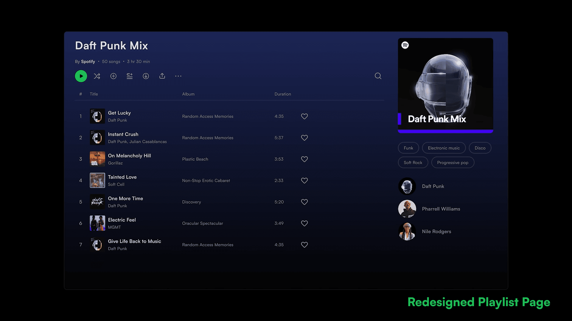
06