Can the extras
an experimental visual study exploring brand identity and cropability in post-consumption packaging
00

problem
Walk down any beverage aisle, and a monotonous pattern emerges: regardless of the brand, soda cans are trapped in rigid, predictable design templates. Industry guidelines dictate exactly where the logo, brand name, and nutritional information must sit. This strict adherence to "safe" layouts limits creative expression and operates on the assumption that a brand's identity only functions when viewed perfectly intact within its designated zone.
solution
This project breaks packaging out of these restrictive templates by exploring the absolute limits of logo cropability. By aggressively cropping the graphics and physically crushing the cans, the study isolates the brand mark to see exactly how much heavy lifting a fragmented logo can do on its own for consumer recognition, completely independent of standard layouts.
A truly powerful brand shouldn't need a rigid, predictable template to be recognized.
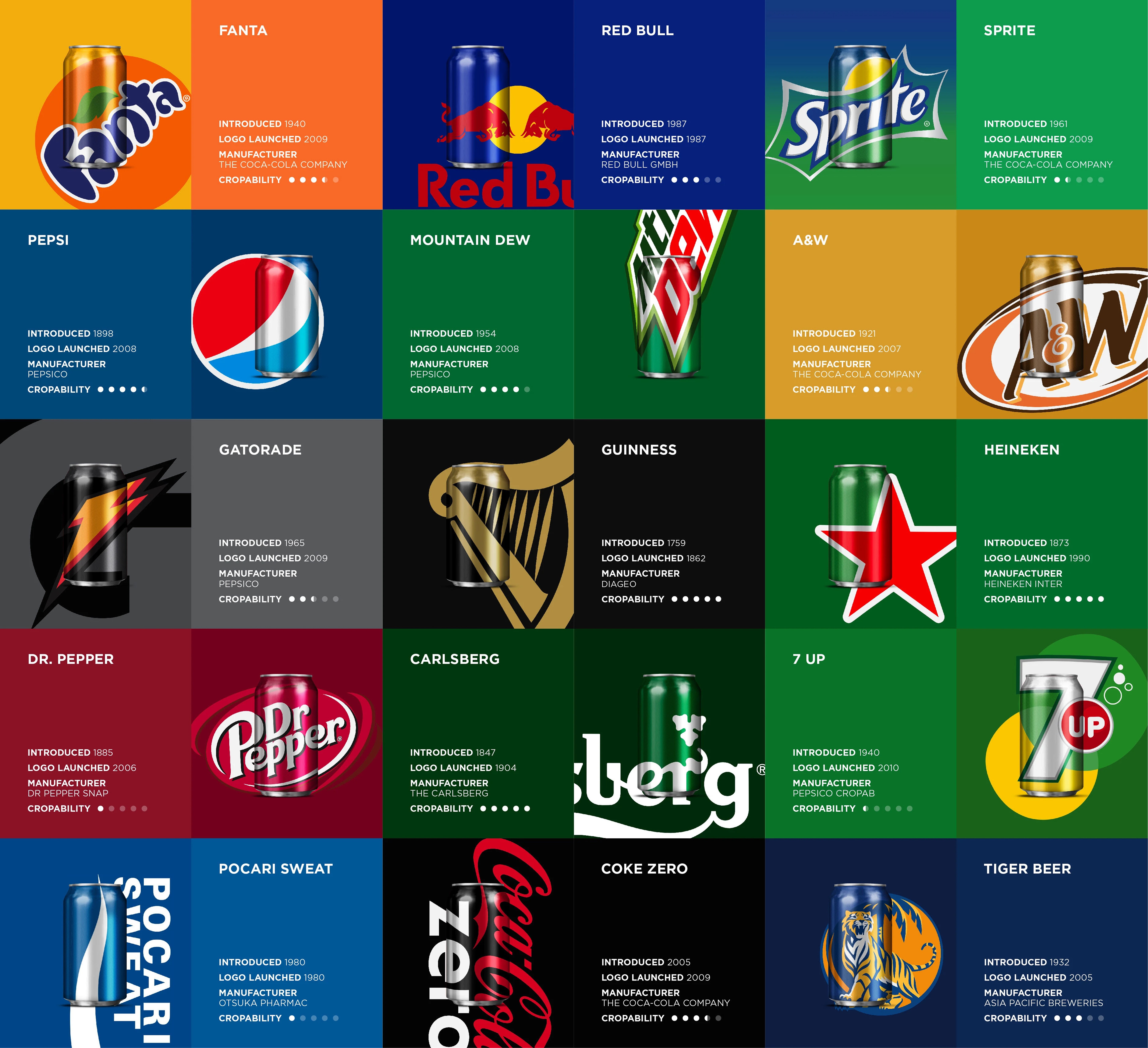
Standard packaging guidelines trap brands in safe layouts, enforcing strict rules about clear space and logo positioning. To challenge this industry norm, I conducted an experimental visual study to break these templates completely and see what happens when those safety nets are removed.
Using a framework of semantics, syntactics, and pragmatics, the project focused heavily on the concept of "cropability". By physically crushing the cans and aggressively cropping the visual identities of global brands, I stripped away the standard layout entirely.
The goal was to test the threshold of cognitive recognition; to see just how much a logo can do on its own. The results proved that effective visual design transcends its template. Even when heavily cropped, distorted, and abstracted, the core visual data of a strong brand is still highly recognizable, proving that identity exists far beyond the confines of a standard packaging layout.
01

02

03

04

05

06

07

08

09


